HUDson Hawk (The King of Terrible Puns Returns!)
Okay, I’m back! Sorry for the delay, my job got super-crazy there for a month or so. It hasn’t really let up too much, but it’s enough that I was able to get a little bit done. However, nothing really to show for it, I’m afraid.
But, I do have SOMETHING interesting: a look into the HUD design process. This work was done almost a month ago, but I haven’t had time to even sit down and write this entry until now.
Necessary elements
There are a few elements that are necessary on the in-game HUD:
- Player name – Especially important in two-player mode, having both players’ names on-screen will help to differentiate which statistics belong to which player
- Lives – Also very important is the number of lives that a player has.
- Score – Points. Very important.
- Weapon Charge – You’ll acquire weapons charge throughout the course of the game, which you’ll be able to spend to temporarily upgrade your weapons. This meter will show you how much charge you have. I chose to represent this with a blue bar.
- Secret Charge – I’m not quite ready to divulge this little gem, but this meter only fills up when the blue (weapon charge) meter is completely full. I chose yellow for this one.
(Mockups of the design process below the fold)
Mockups!
I quickly made a mockup of my initial idea for the hud.
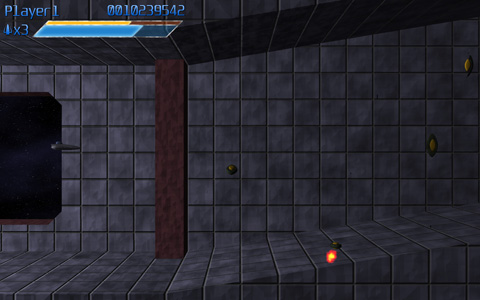
The first suggested modification was to swap the two meters vertically. Because the yellow bar only fills up when the blue meter is full, it would be analogous to pouring in water (filling from the bottom up). I liked this concept, so I swapped the bars (I wanted to get just one readout set up, so I took out Player 2 for the next while):
At that point, I didn’t really feel that the look was consistent. The text didn’t match the bars, and I didn’t like the look of the gradient on the text. So I reworked both so that they had bright centers fading to darker colors at the top and bottom extremeties, which really unified the look of the various elements
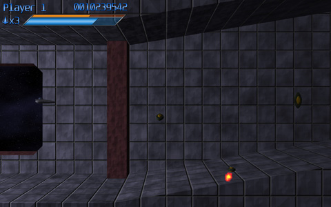
At this point, it was noted that the bar looked kind of stupid relative to the text, since it’s so much larger. So the scale of the bars was modified to match the height of the text. This also allowed a little bit of the height to be taken out of the HUD.
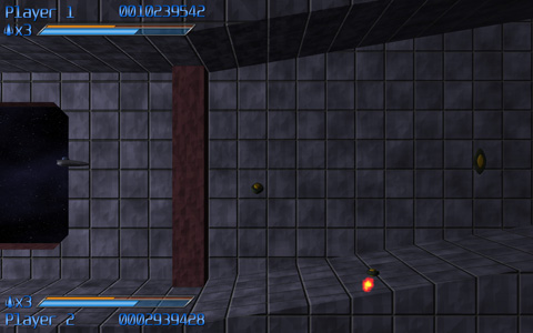
At this point, I was happy with the layout, so I set out to figure out how to put the second player in. Initially I had two options:
The first one is sort of the “classic” two player layout. The second was optimized so that there would be a minimum of data sitting over where the enemies are coming from (potentially obscuring relevant enemy activity). However, everyone that I talked to (including myself, though I promise that dialogue was mostly internal) thought that option B was a pretty terrible-looking layout, so I scrapped it entirely…but I wasn’t entirely happy with the first option, either.
So I started to play around some more.
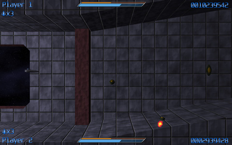
I spread out one bar across the entirety of the top of the screen, and placed the second one at the very bottom of the screen. It’s unobtrusive and quite neat:
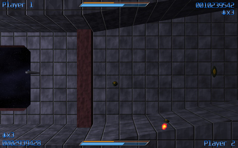
…but it seemed a bit off-balance. Eventually, mittens had a great idea: why not mirror one of the bars (swap the elements left to right), so that it would be more or less radially balanced. So I basically did that, I moved the top player’s life count off to the right edge of the screen, and swapped the player name and the score of the bottom player. And it actually looks pretty good!
…but some people still really liked the “classic look”
Have Your Cake and Eat It, Too
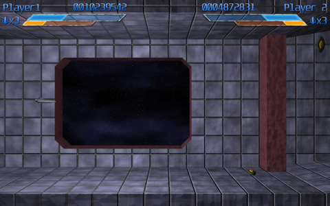
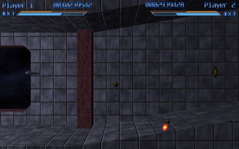
So I opted for both! The default will be the new theme (conveniently entitled “Default”). But the option will be there for the “Classic” HUD, for those that prefer it.
So here they are!
The current UI layouts for the game!
Hope that gave you some insight into the craziness of the process! Enjoy!
