This will probably be the norm for a while, unless I find myself with an excess of time some night; there’ll probably just be some project updates for a few weeks.
Progress on finishing the first level is going good, all of the main enemies are implemented, the level 1 boss is designed (but not yet coded), and I’m on my way towards getting the level done by the end of the month.
(Screens and videos below the fold)
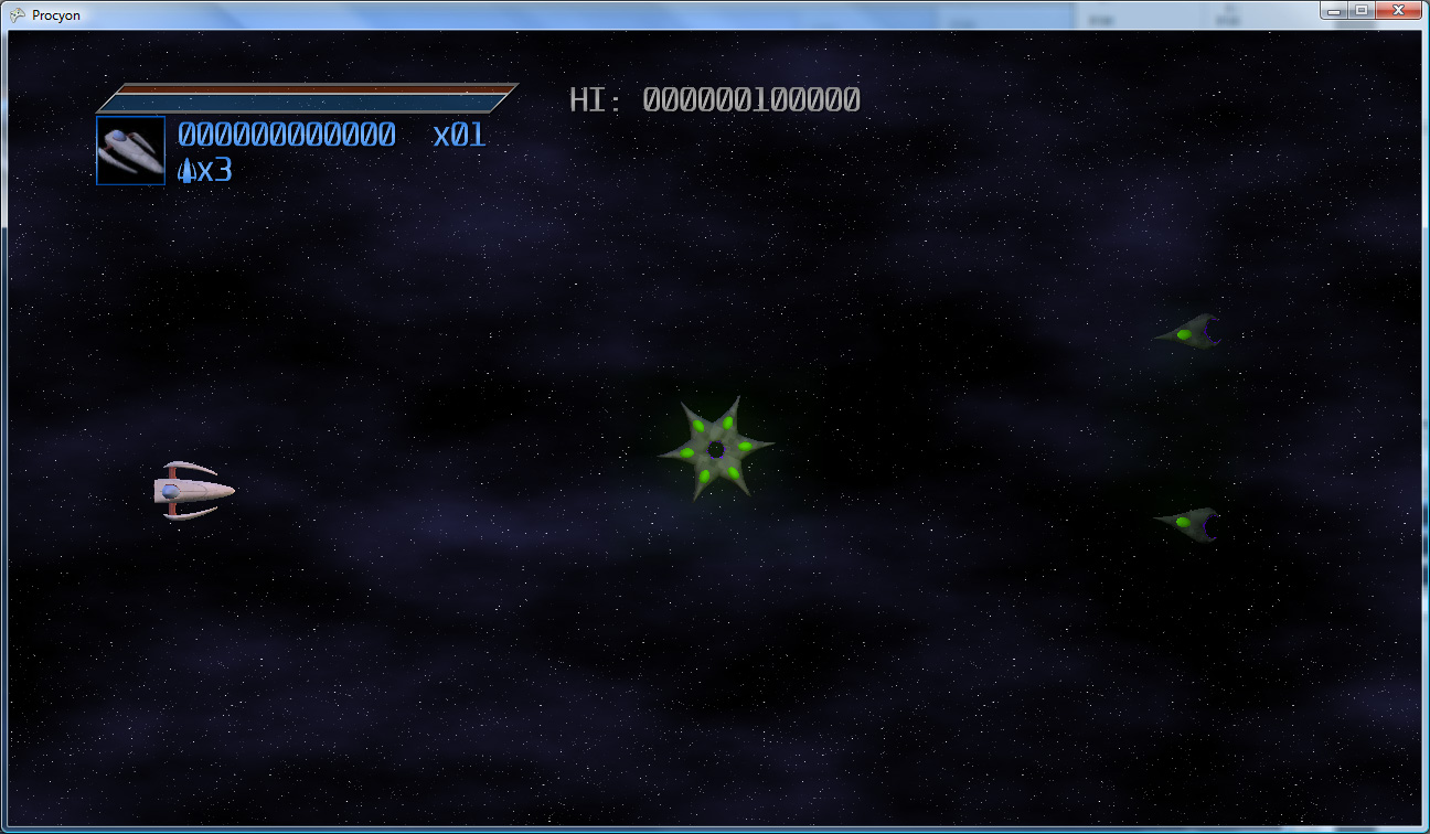
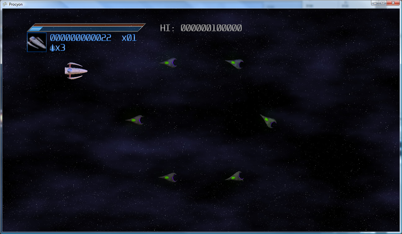
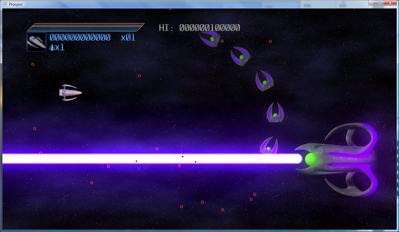
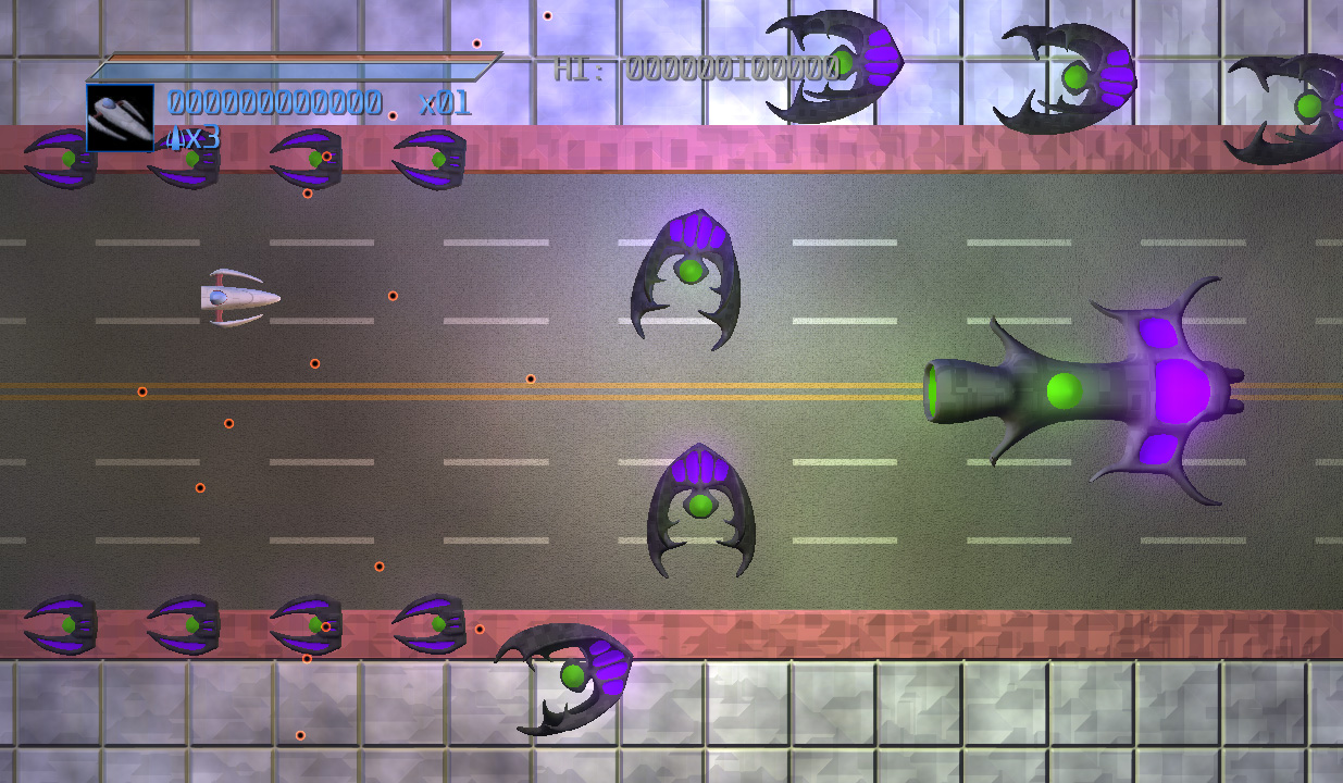
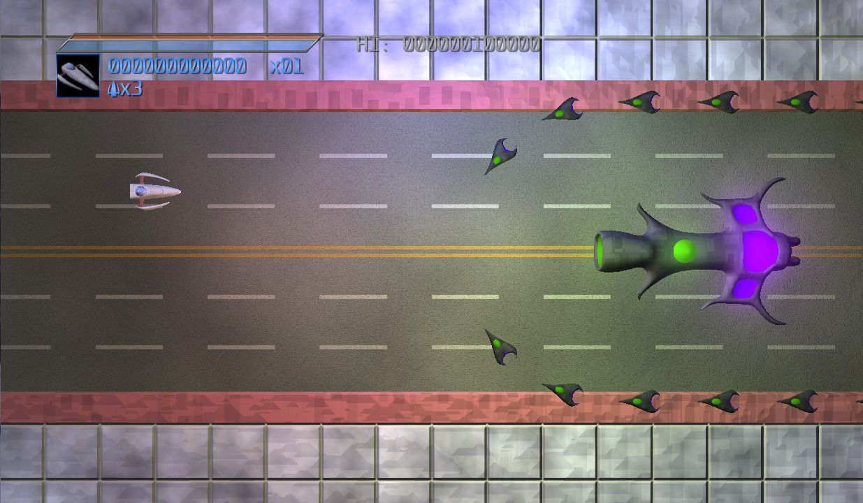
Enemies
For the enemy designs, I looked to things like insects and aquatic creatures to get ideas for shapes and the like. Some screenshots!
And, a couple videos of the enemies in action:
Current Work
The next few items of work are:
- Finish the implementation of the boss of level 1
- Lay out the level
- Add the scrolling background
- Profit!
I haven’t made any specific posts about my game in a while, so I thought I’d just make a quick status update.
Code Progress
Progress is coming along quite nicely. Most of the game systems are done (though I have some modifications to make to enable things like curved enemy beam weapons and side-by-side ship paths).
- Enemies have multiple ways of spawning, and can follow paths (or not).
- All four weapons are implemented
- The player can now die (and respawn). Lives are tracked (but the game currently doesn’t game-over if the player dies, as that would be a pain for testing).
- The scoring system is in (with a first run at a score multiplier system).
- The on-screen display has been completely redesigned.
- Two players can play at once, which includes a special combination lightning attack that is even more devastating than the standard lightning attack.
(Screens and videos below the fold)
Here is a video of a lot of those systems in action:
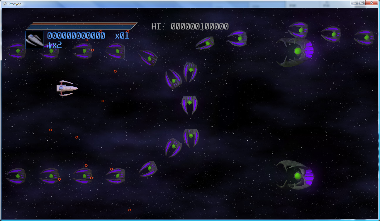
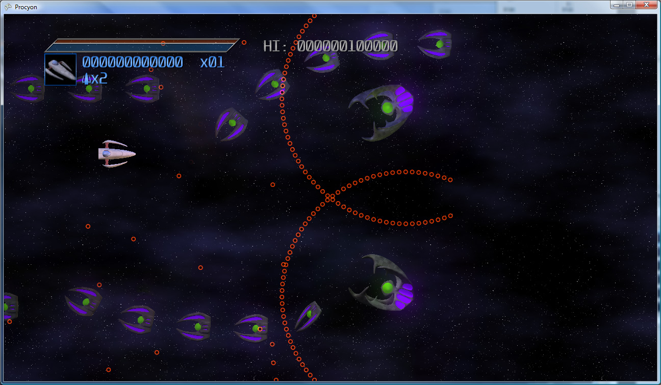
Art Work
For the last few evenings, I’ve been working on designs for the enemy ships (though I’ll note that the background is still very much throwaway temp art). I plan to have about 5 or 6 types of ships in the first level of the game (not counting the boss) – and the goal is to have at least 2 new types in each successive level of the game.
Here are a few of the current designs:
The goal is to make the ships look fairly organic – I’m completely avoiding hard edges (except for claw-like points), and trying to make them as smooth and rounded as possible. Thanks to Silo and its subdivision surfaces, this is actually pretty easy 🙂 The gray/green/purple combination feels, to me, rather otherworldly, and it’s less “standard” than the traditional black and red alien ship motif (i.e. Cylon ships). The color scheme will pose some interesting problems when it comes time to make levels inside of alien locations though – I’ll need a way to make the alien ships stand out from the background, while simultaneously make the background feel like it belongs to the same creatures that are piloting those ships.
Goals
I’m aiming to have two full levels of the game done by the end of next month, which should give me adequate time to get everything that needs to be implemented for them implemented, and polish them to a nice shine. There’s still quite a bit to do:
- As stated above, I want to allow curved beam weapons from the enemies (the player’s curved beam weapon is currently a special case)
- Also stated above, I want to be able to have enemies spawn side-by-side along paths (so that I can easily make them fly in in formations instead of just one at a time)
- There’s no sound/music code yet, though with XNA that’s pretty straightforward.
- Controller rumble!
- I’m sure there’s some code that I’ll need to add to enable giant boss fights.
- Not to mention the additional art/sound/music work to make it all shine.
It’s going to be an interesting month and a half. Off I go, I’ve got work to do!
Okay, I’m back! Sorry for the delay, my job got super-crazy there for a month or so. It hasn’t really let up too much, but it’s enough that I was able to get a little bit done. However, nothing really to show for it, I’m afraid.
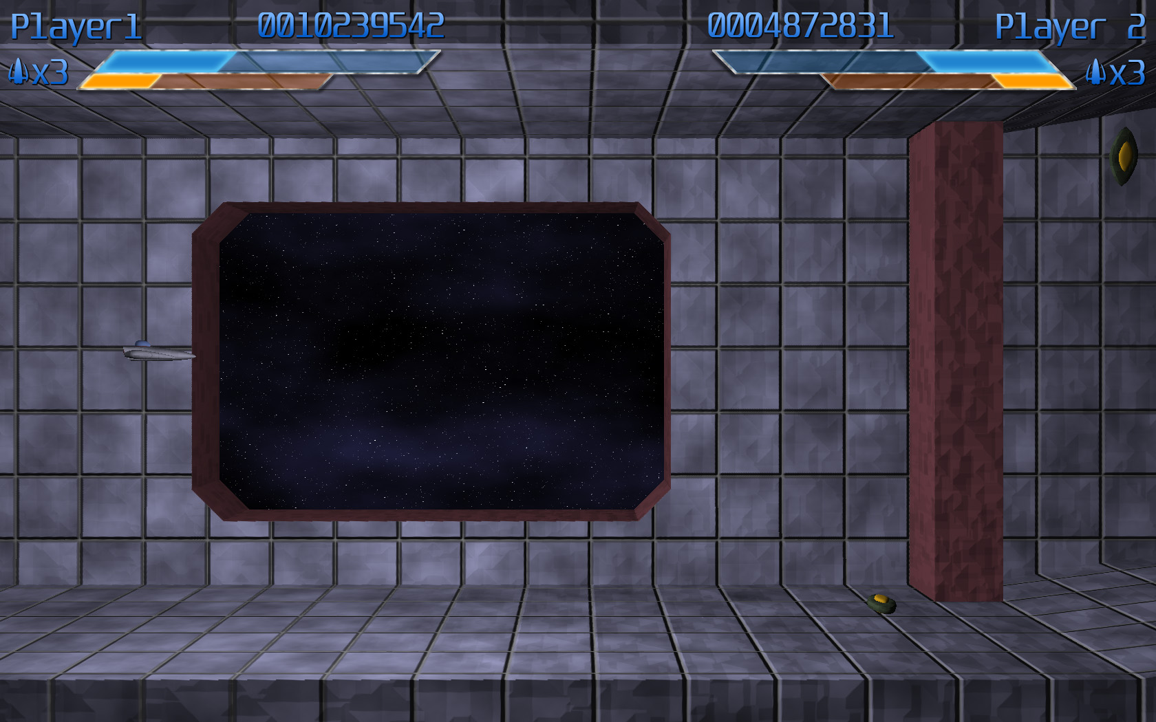
But, I do have SOMETHING interesting: a look into the HUD design process. This work was done almost a month ago, but I haven’t had time to even sit down and write this entry until now.
Necessary elements
There are a few elements that are necessary on the in-game HUD:
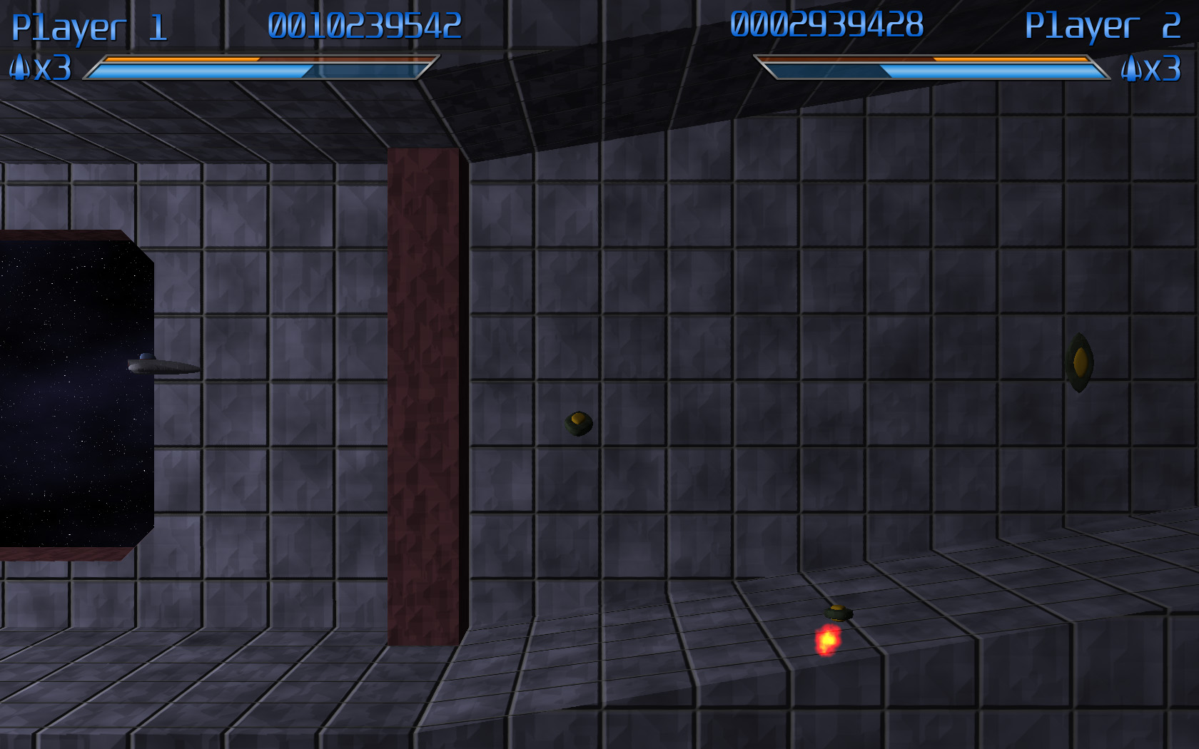
- Player name – Especially important in two-player mode, having both players’ names on-screen will help to differentiate which statistics belong to which player
- Lives – Also very important is the number of lives that a player has.
- Score – Points. Very important.
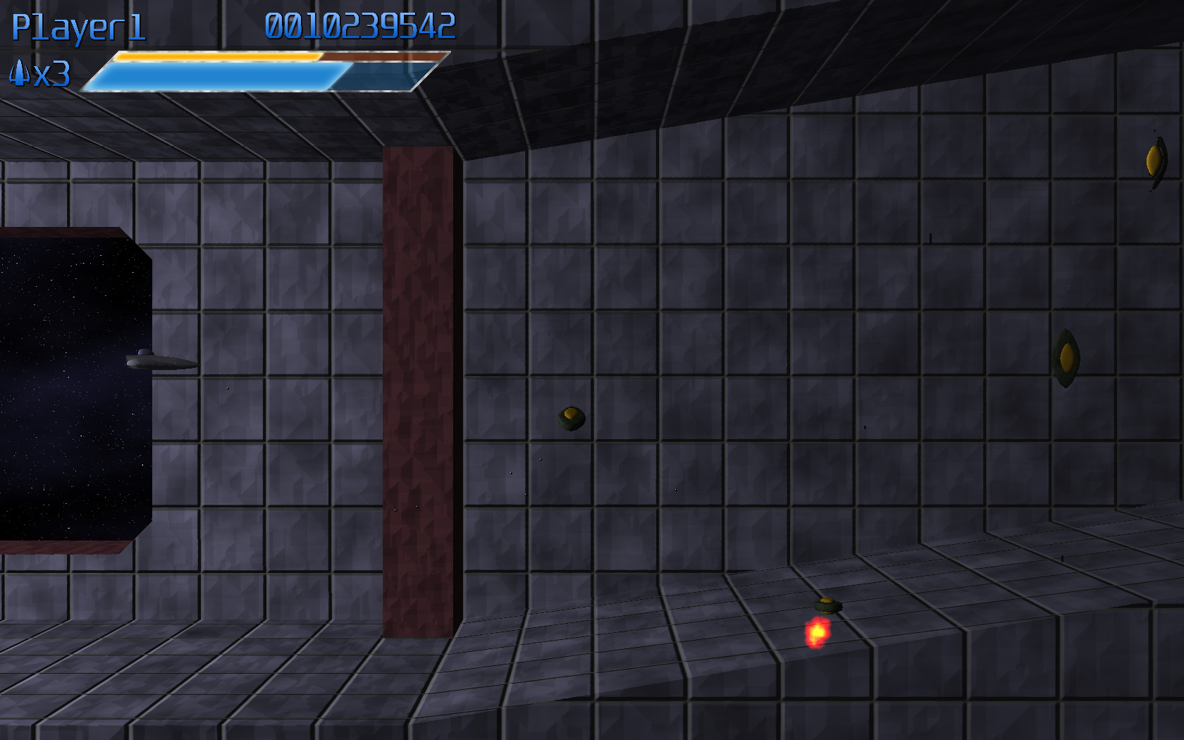
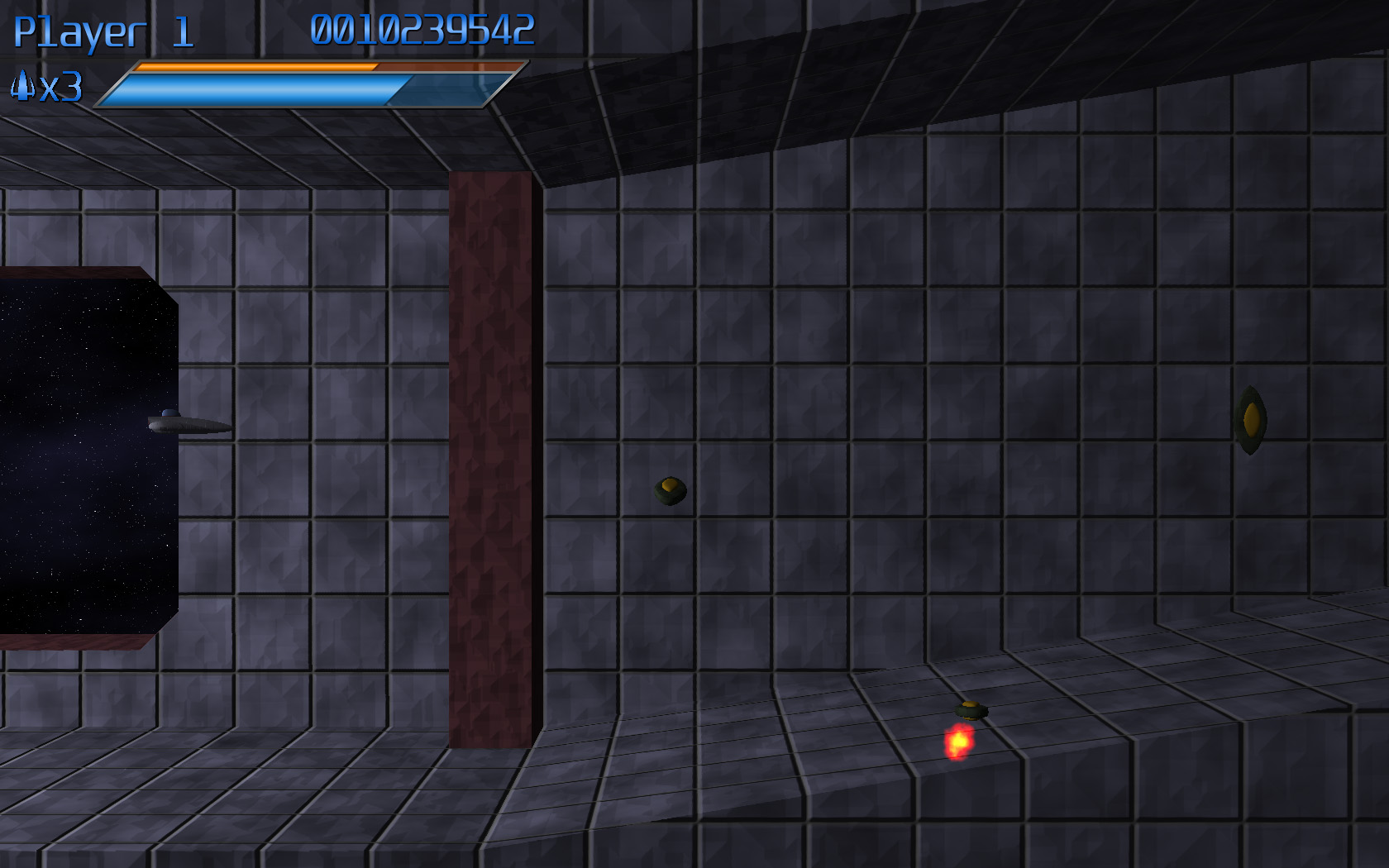
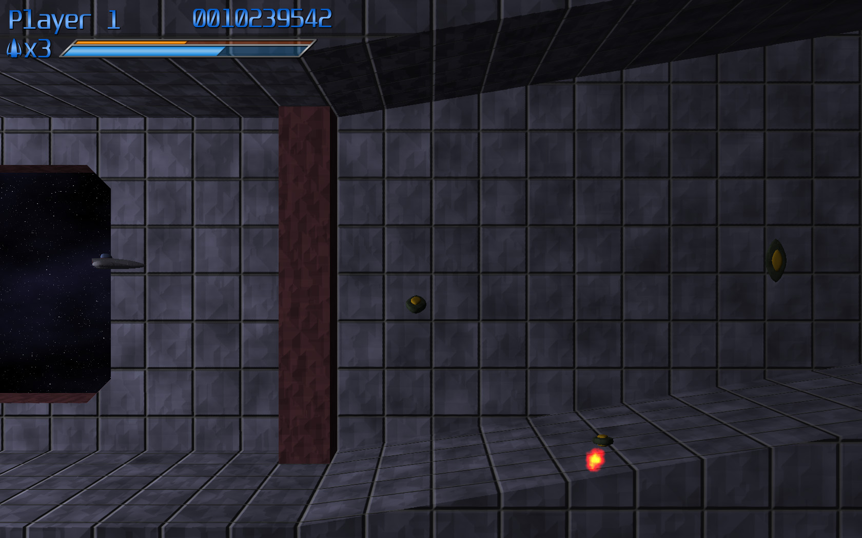
- Weapon Charge – You’ll acquire weapons charge throughout the course of the game, which you’ll be able to spend to temporarily upgrade your weapons. This meter will show you how much charge you have. I chose to represent this with a blue bar.
- Secret Charge – I’m not quite ready to divulge this little gem, but this meter only fills up when the blue (weapon charge) meter is completely full. I chose yellow for this one.
(Mockups of the design process below the fold)
Mockups!
I quickly made a mockup of my initial idea for the hud.
The first suggested modification was to swap the two meters vertically. Because the yellow bar only fills up when the blue meter is full, it would be analogous to pouring in water (filling from the bottom up). I liked this concept, so I swapped the bars (I wanted to get just one readout set up, so I took out Player 2 for the next while):
At that point, I didn’t really feel that the look was consistent. The text didn’t match the bars, and I didn’t like the look of the gradient on the text. So I reworked both so that they had bright centers fading to darker colors at the top and bottom extremeties, which really unified the look of the various elements
At this point, it was noted that the bar looked kind of stupid relative to the text, since it’s so much larger. So the scale of the bars was modified to match the height of the text. This also allowed a little bit of the height to be taken out of the HUD.
At this point, I was happy with the layout, so I set out to figure out how to put the second player in. Initially I had two options:
The first one is sort of the “classic” two player layout. The second was optimized so that there would be a minimum of data sitting over where the enemies are coming from (potentially obscuring relevant enemy activity). However, everyone that I talked to (including myself, though I promise that dialogue was mostly internal) thought that option B was a pretty terrible-looking layout, so I scrapped it entirely…but I wasn’t entirely happy with the first option, either.
So I started to play around some more.
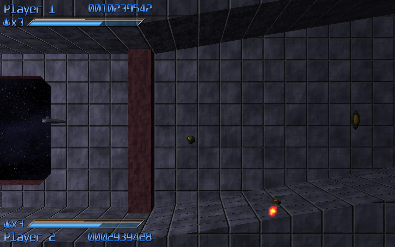
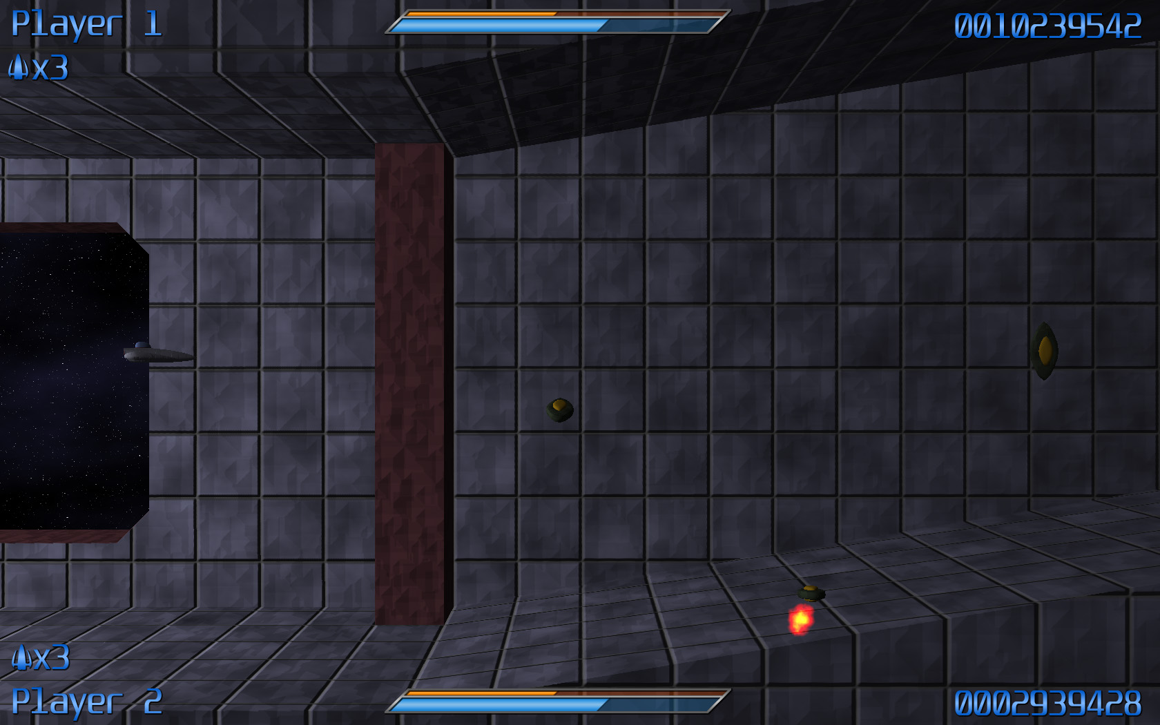
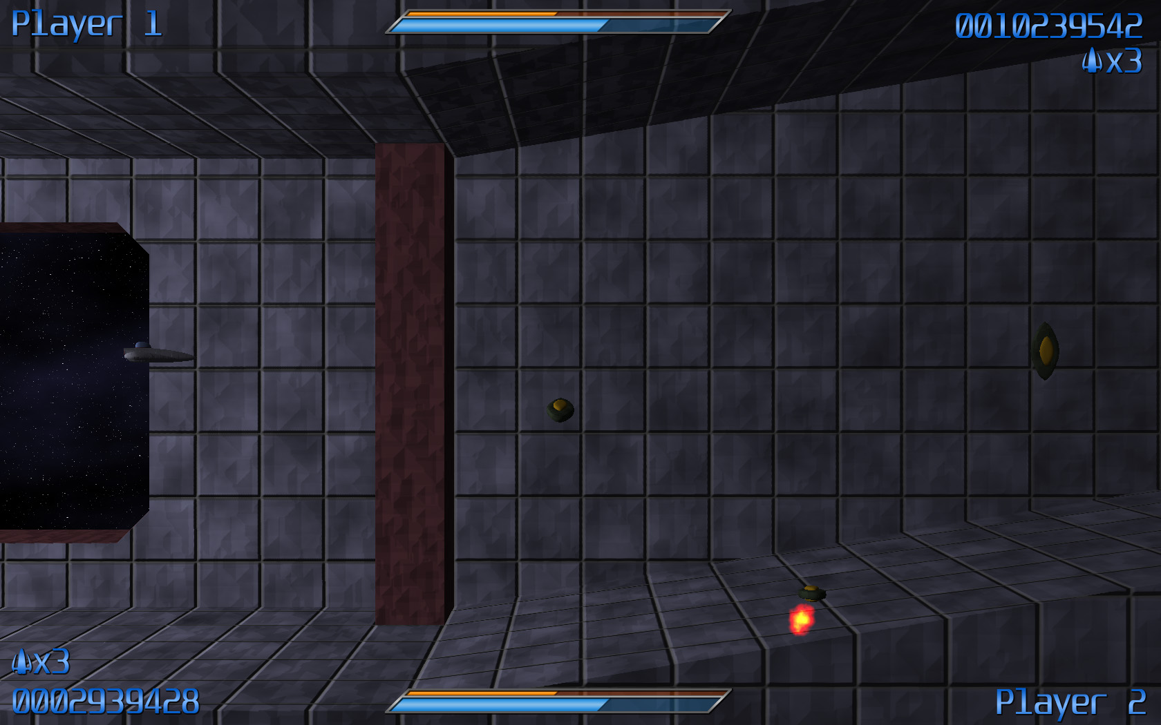
I spread out one bar across the entirety of the top of the screen, and placed the second one at the very bottom of the screen. It’s unobtrusive and quite neat:
…but it seemed a bit off-balance. Eventually, mittens had a great idea: why not mirror one of the bars (swap the elements left to right), so that it would be more or less radially balanced. So I basically did that, I moved the top player’s life count off to the right edge of the screen, and swapped the player name and the score of the bottom player. And it actually looks pretty good!
…but some people still really liked the “classic look”
Have Your Cake and Eat It, Too
So I opted for both! The default will be the new theme (conveniently entitled “Default”). But the option will be there for the “Classic” HUD, for those that prefer it.
So here they are!
The current UI layouts for the game!
Hope that gave you some insight into the craziness of the process! Enjoy!